
A navigation bar is a crucial component of any website or web application, providing users with easy access to different sections or pages of a site. A responsive navigation bar that adapts to different screen sizes is even more important in today’s mobile-first world. In this tutorial, we’ll explore how to build a responsive navigation bar using React, the popular JavaScript library for building user interfaces. We’ll use React functional components and SCSS to style our navigation bar.
Prerequisites:
To follow along with this tutorial, you should have some basic knowledge of HTML, CSS, and JavaScript. You should also have Node.js and npm installed on your computer. Finally, you should have a basic understanding of React, including functional components and hooks.
Step 1: Setting Up the Project
Let’s start by creating a new React project using Create React App. Open a terminal window and navigate to the directory where you want to create your project. Then, run the following command:
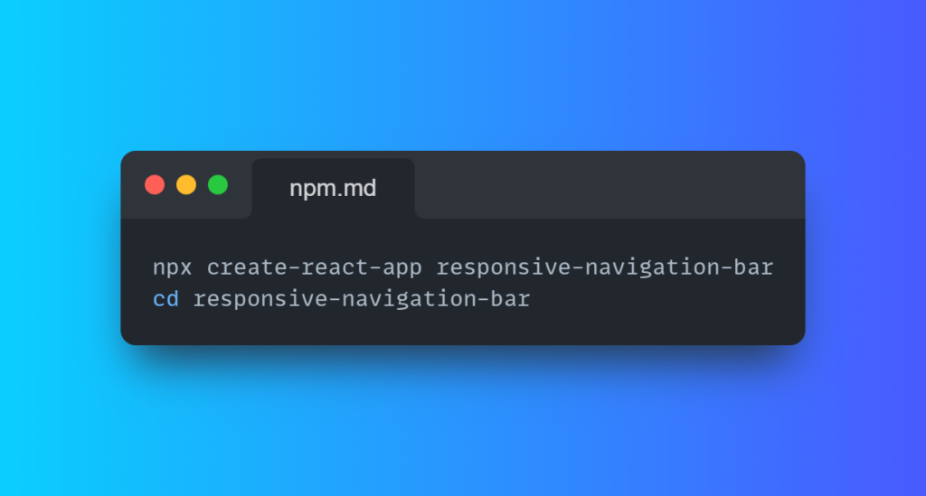
This will create a new React project called “responsive-navigation-bar” and navigate you into the project directory.
Step 2: Creating the Navigation Component
Next, let’s create a new functional component called Navigation in the src/components directory. This component will contain the HTML markup for our navigation bar. Here’s the code:
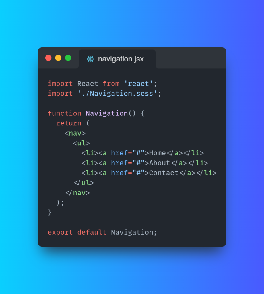
In this code, we’ve imported React and our SCSS file. Then, we’ve defined a functional component called Navigation that returns some HTML markup for our navigation bar. We’ve included an unordered list with three list items that contain links to Home, About, and Contact.
Step 3: Styling the Navigation Bar
Now, let’s style our navigation bar using SCSS. Create a new file called Navigation.scss in the src/components directory and add the following code:
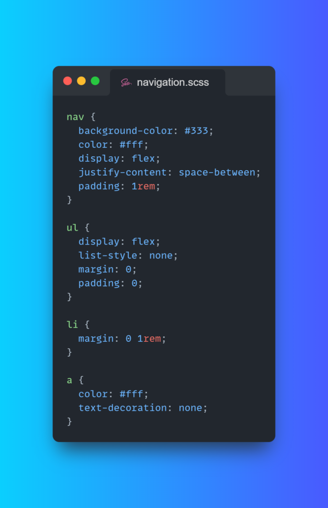
In this code, we’ve defined some styles for our navigation bar. We’ve set the background colour to #333 and the text colour to #fff. We’ve also used flexbox to horizontally align the list items and create some space between them. Finally, we’ve styled the links with white text and no underline.
Step 4: Adding a Hamburger Menu
Next, let’s add a hamburger menu icon that will be visible on small screens. When the user clicks on this icon, the navigation menu will be displayed in a dropdown. We’ll use the React useState hook to manage the state of the dropdown. Here’s the updated Navigation component:
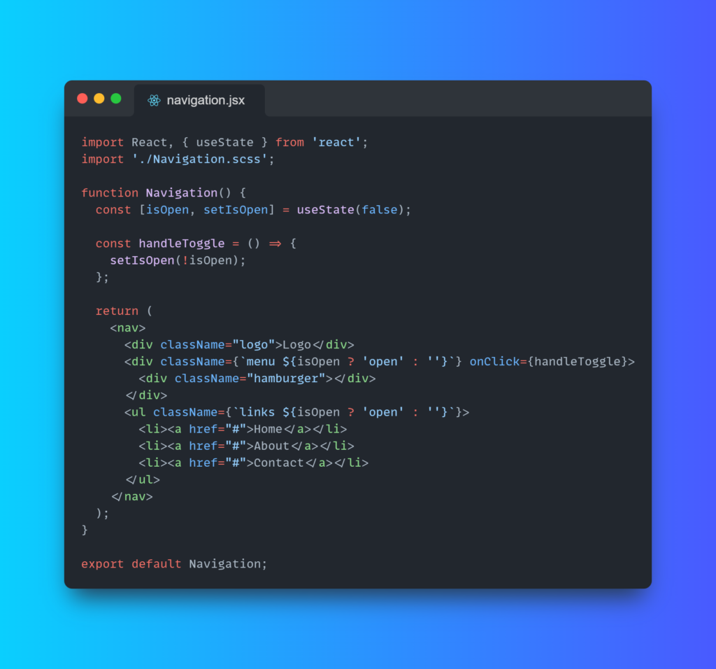
In this updated code, we’ve added some state to manage whether the dropdown menu is open or closed. We’ve defined a handleToggle function that toggles the isOpen state when the menu icon is clicked. We’ve also added some conditional classes to show or hide the dropdown menu based on the isOpen state.
Next, let’s update our SCSS file to style the hamburger menu and the dropdown menu. Add the following code to Navigation.scss:
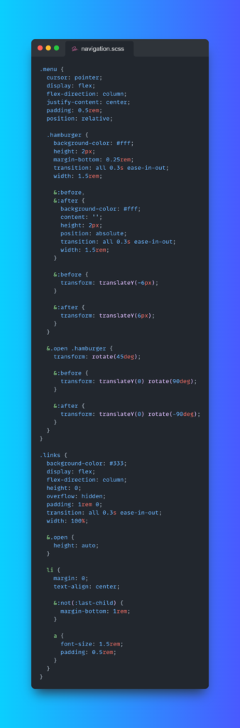
In this code, we’ve defined styles for the hamburger menu icon and the dropdown menu. We’ve used flexbox to vertically align the menu icon and horizontally center the lines. We’ve also used some CSS transformations to animate the icon when the dropdown menu is opened. For the dropdown menu, we’ve set the height to 0 and overflow to hidden to hide the menu by default. We’ve also used some transitions to animate the opening and closing of the menu.
Step 5: Using the Navigation Component
Finally, let’s use our Navigation component in the App.js file. Replace the existing code with the following:
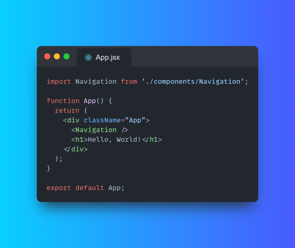
In this code, we’ve imported our Navigation component and added it to the App component. We’ve also added a simple heading to demonstrate that our navigation bar is responsive.
Step 6: Testing the Navigation Bar
Now that we’ve completed our navigation bar, let’s test it out by running the application. In the terminal window, run the following command: npm start
This will start the development server and open the application in your default browser. You should see a navigation bar with a hamburger menu icon on small screens. Clicking on the menu icon should reveal a dropdown menu with links to Home, About, and Contact.
Conclusion:
In this tutorial, we’ve explored how to build a responsive navigation bar using React and SCSS. We’ve used functional components and hooks to manage the state of our dropdown menu. We’ve also used flexbox and CSS transitions to style our navigation bar and animate the menu icon and dropdown menu. With this knowledge, you can now create your own responsive navigation bars and add them to your React applications.